ML for Digital Humanities #01 — Exploring the Data
We pose the problem, load a Mimbres ceramic dataset, and conduct an initial data analysis.
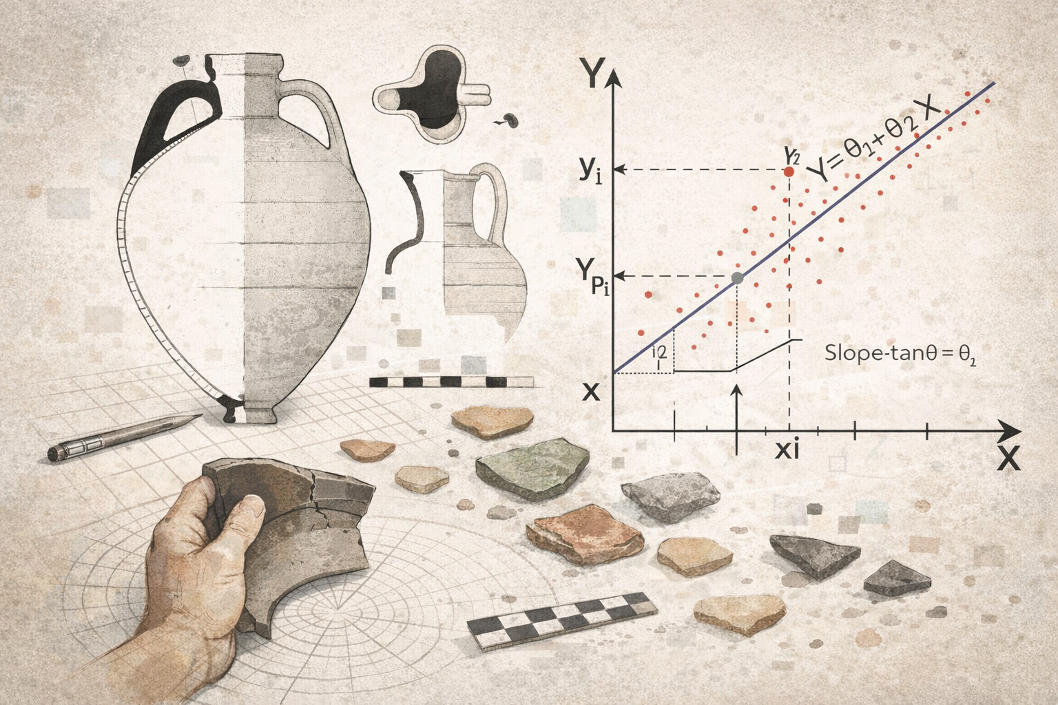
In the previous post, we posed the central question of this project: Could we build a model capable of estimating the height of a ceramic vessel if we only know the diameter of its rim?
In this first article, we will explore different methodological possibilities, progressively improving our solutions. To do this, we will start by analyzing the available data in detail.
Interactive Notebook Available:
All the code and analysis in this article is also available as a Jupyter Notebook. Click the button above to run it interactively in Google Colab (no installation needed).
The Dataset: Mimbres Pottery
Mimbres pottery is a pre-Columbian ceramic style from the southwestern North America (9th–12th centuries) primarily known for its distinctive black-and-white bowls decorated with complex geometric and narrative scenes. We have access to an open-access dataset with detailed information about these pieces, part of the Mimbres Pottery Images Digital Database (MimPIDD) maintained by the Digital Archaeological Record (tDAR) platform. The original dataset was published in 2013 and contains comprehensive information online: https://core.tdar.org/filestore/download/381506/567752 (tDAR ID: 381506, DOI: https://doi.org/10.6067/XCV8BP03GM).
Initial Exploration
When analyzing the dataset, we discovered it contains 45 columns and 2168 rows. The available columns are:
columns = [
    'MimPIDD_ID', 'tDAR_ID', 'tDAR_Status', 'owner', 'record_created',
    'Collection', 'museum_no', 'site_name', 'site_number', 'within_site',
    'within_site_category', 'room_number', 'field_num_or_old_num',
    'vessel_form', 'condition', 'wear', 'kill_hole', 'kill_hole_form',
    'rim_diam', 'height', 'max_diam', 'color_scheme', 'temporal_style',
    'temporal_style_basis', 'design_class', 'layout', 'layout_detail',
    'figurative_general', 'figurative_specific', 'geometric_general',
    'geometric_specific', 'narrow_rim_bands', 'wide_rim_bands',
    'interior_band', 'exterior_design', 'publication', 'other_data',
    'b_w_image_filename', 'b_w_image_directory', 'color_image_filename',
    'color_image_directory', 'hachure_type', 'artist_set',
    'artist_set_archive_no', 'inaa_sample_number_and_da'
]
Of all these varied columns, we focus on just two for this initial analysis: the rim diameter (rim_diam) and the height (height). After cleaning the dataset by removing rows with missing values in these columns, we reduced the set to 1653 complete records with useful information.
First Visualization
Let’s start by loading the dataset and plotting our sample to identify patterns or potential problems:
import pandas as pd
import matplotlib.pyplot as plt

# Load the dataset and select the variables of interest
df = pd.read_csv("mimbres_data.csv")
df = df[["rim_diam", "height"]]

# Initial visualization
plt.figure(figsize=(10, 6))
plt.scatter(df["rim_diam"], df["height"], alpha=0.5)
plt.xlabel("Rim Diameter (rim_diam)")
plt.ylabel("Height (height)")
plt.title("Relationship between Rim Diameter and Height (Raw Data)")
plt.grid(True, alpha=0.3)
plt.show()
×
×
Data Cleaning and Transformation
After observing the initial graph, we identified some problems. We see that the distribution is not as expected, with no clear pattern beyond a possible line crossing from end to end. Additionally, we notice that the metric lines at the edges seem to compress together, which suggests there may be a problem with the data type we’re working with, so we need to verify it.
We should have done this type of verification before even plotting, but I thought it was more instructive to reach this error so we could visualize it clearly.
# Check data types
print(df.dtypes)
rim_diam object
height object
dtype: objectWe discovered that both columns are stored as objects (strings) instead of numeric values, so we proceed to transform them:
# Clean non-numeric characters
df["height"] = df["height"].str.replace(r"[^\d.]", "", regex=True)
df["rim_diam"] = df["rim_diam"].str.replace(r"[^\d.]", "", regex=True)

# Convert to numeric values
df["height"] = pd.to_numeric(df["height"], errors="coerce")
df["rim_diam"] = pd.to_numeric(df["rim_diam"], errors="coerce")

# Remove rows with missing values
df = df.dropna()

print(f"Clean dataset: {df.shape[0]} rows, {df.shape[1]} columns")
Clean dataset: 1626 rows, 2 columnsSecond Visualization (Clean Data)
Now let’s plot again with the clean data:
plt.figure(figsize=(10, 6))
plt.scatter(df["rim_diam"], df["height"], alpha=0.5, edgecolors='k', linewidth=0.5)
plt.xlabel("Rim Diameter (cm)")
plt.ylabel("Height (cm)")
plt.title("Relationship between Rim Diameter and Height (Clean Data)")
plt.grid(True, alpha=0.3)
plt.show()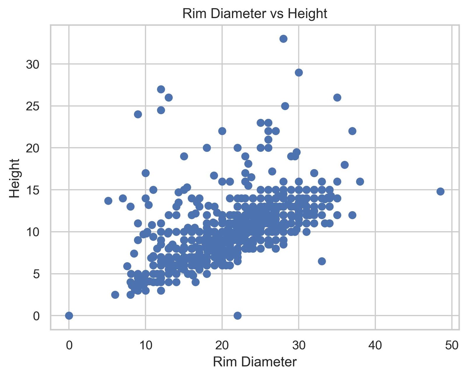 ×
×
When visualizing this second graph, the pattern is evident: there is a directly proportional relationship between the rim diameter and the height of the pieces. Wider ceramics tend to be taller. Although the distribution shows considerable variability around that general trend, and there are some outliers that deviate from the pattern, the fundamental message is clear. This observation suggests that a linear model could reasonably capture this relationship.
Fitting a Linear Regression Model
Given the apparent linear relationship, we proceed to fit a simple linear regression model using scikit-learn:
from sklearn.linear_model import LinearRegression
from sklearn.metrics import r2_score, mean_squared_error
import numpy as np

# Prepare the data
X = df[["rim_diam"]].values
y = df["height"].values

# Create and train the model
model = LinearRegression()
model.fit(X, y)

# Get predictions
y_pred = model.predict(X)

# Calculate metrics
slope = model.coef_[0]
intercept = model.intercept_
r2 = r2_score(y, y_pred)

print(f"Slope: {slope}")
print(f"Intercept: {intercept}")
print(f"R²: {r2}")
Slope: 0.35683210484689987
Intercept: 2.2774553756170146
R²: 0.4135030610203171The results we obtained from the model are as follows: a slope of 0.3568, an intercept of 2.2775, and an R² value of 0.4135. These numbers will tell us much about the quality of our fit, so let’s delve into them.
Intercept and Slope
These two concepts are quite straightforward. The slope is the inclination of the line we have predicted as a generalization of the distribution. The intercept, on the other hand, is the point where the line crosses the y-axis at x=0.
Interpretation of R²
On the other hand, the R² value of 0.4135 provides us with more information. Simplifying, it means that our model explains only 41.35% of the variability present in the data. In practical terms, this means that more than half of the variations we see in the height of the pieces are not simply attributable to the rim diameter. In other words, there are other factors at play: perhaps the overall shape of the vessel, local style, specific time period, or even the type of ceramic. A larger diameter tends to come with taller pieces, yes, but this relationship is weaker than it might initially appear.
The Regression Line
Let’s visualize the fitted model together with our data:
import matplotlib.pyplot as plt
plt.figure(figsize=(10, 6))
# Scatter: gray + thin black border
plt.scatter(
df["rim_diam"],
df["height"],
color="gray",
edgecolors="black",
linewidths=0.3,
alpha=0.8
)
# Regression line in red
plt.plot(
df["rim_diam"],
y_pred,
color="red",
linewidth=2
)
plt.xlabel("Rim Diameter")
plt.ylabel("Height")
plt.title("Linear Regression: Rim Diameter vs Height")
plt.tight_layout()
plt.show()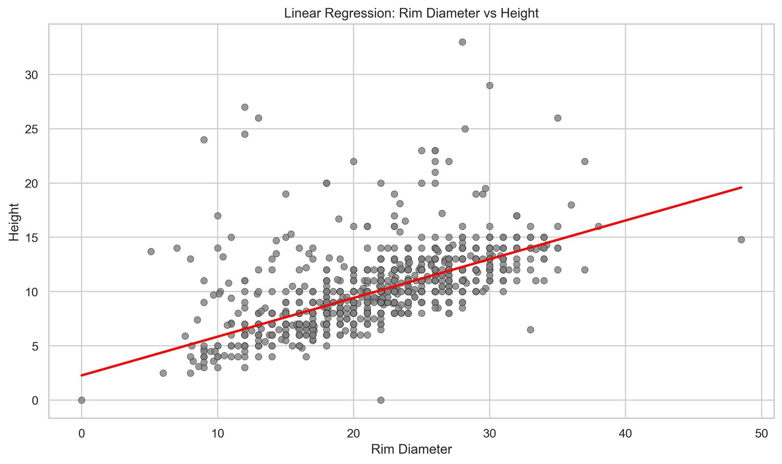 ×
×
The red line crossing the cloud of points represents the best linear approximation to our data. It is the function that, in mathematical terms, commits the least error possible when trying to explain height using only diameter. You can use this line as a general rule: if you know the diameter of a Mimbres vessel, you can project onto this line to get an estimate of its expected height. But before moving forward, it would be appropriate to understand how this concept arises, where this line comes from. To do that, we’ll take a brief historical journey.
Francis Galton and the Seed Experiment (1875)
The earliest known reference dates back to 1875, when Francis Galton distributed packets of sweet pea seeds among seven friends. Each packet contained seeds of uniform weight.
After cultivating and harvesting them, Galton compared the weights of the daughter seeds with those of the mother seeds, asking the question: “If a mother seed is very heavy, will her daughters be equally heavy?”
The result would mark a turning point: large seeds tended to produce large seeds, but not as large as the mother; and the opposite for small seeds. Galton observed a “regression to mediocrity” (regression to mediocrity, or regression to the mean), where extreme values did not perpetuate with the same intensity.
Regression to the Mean
This finding is the origin of the term “linear regression.” As Galton himself noted: there is a natural tendency toward average values in successive generations. By plotting this data, he observed for the first time the line of continuous improvement that we today know as the regression line.
Reference: Galton, F. (1877). “Typical Laws of Heredity.” Proceedings of the Royal Institution.
Original Document
From Intuition to Mathematics
Although Galton was the first to observe this phenomenon, it was his student Karl Pearson (1857–1936) who brought this intuition into rigorous mathematical territory. Pearson, whom many remember for the correlation coefficient that bears his name, was not satisfied with just seeing the pattern; he wanted to express it in equations. He introduced the concept of covariance, which measures how two variables move together. He developed correlation, which normalizes that covariance to capture the strength of the relationship in a number between -1 and 1. And, perhaps most importantly, he formalized the method of least squares fitting, which is exactly the technique we use today to find that red line crossing our ceramic graph.
Interestingly, this least squares technique was not Pearson’s invention. Carl Friedrich Gauss (1777–1855) and Adrien-Marie Legendre (1752–1833) had already developed it independently nearly a century earlier, albeit in completely different contexts. Gauss used it in astronomy to predict the orbits of planets and asteroids; Legendre applied it in geodesy to make precise measurements of the Earth.
Coming back to our model, let’s proceed with its evaluation:
Model Evaluation: Error and Residuals
When we build a model (in this case using Linear Regression) there is an underlying mathematical formulation that aims to minimize the difference between predictions and actual values.
A simple way to understand this is to imagine trying many possible lines and selecting the one that best fits the data. In reality, this process is not random: the optimal solution is found either through optimization methods or directly using a closed-form expression known as the Normal Equation.
To measure this error, the most common metric is the Mean Squared Error (MSE), which squares the differences between predicted and real values, penalizing larger deviations more strongly. During training, the model adjusts its parameters to minimize this value.
from sklearn.metrics import mean_squared_error

mse = mean_squared_error(y, y_pred)
rmse = np.sqrt(mse)

print(f"MSE: {mse:.6f}")
print(f"RMSE: {rmse:.6f}")
MSE: 5.526848596916834
RMSE: 2.350925051318488The numbers we obtain from the explicit calculation are: an MSE of 5.527 and an RMSE of 2.351. That RMSE is particularly useful because it is in the same units as our data: centimeters. It means that, on average, when our model makes a prediction about the height of a vessel, it is off by approximately 2.35 cm. In the context of pieces that can measure between 5 and 30 cm in height, this error is not negligible. The model follows the general trend quite well, but has real limitations in its ability to make precise predictions.
Distribution of Residuals
Let’s analyze the distribution of error to better understand where our model fails:
residuals = y - y_pred

plt.figure(figsize=(12, 5))

# Graph 1: Residuals vs Predictions
plt.subplot(1, 2, 1)
plt.scatter(y_pred, residuals, alpha=0.5, edgecolors='k', linewidth=0.5)
plt.axhline(y=0, color='r', linestyle='--', linewidth=2)
plt.xlabel("Predicted Values")
plt.ylabel("Residuals")
plt.title("Residuals vs. Predictions")
plt.grid(True, alpha=0.3)

# Graph 2: Histogram of residuals
plt.subplot(1, 2, 2)
plt.hist(residuals, bins=30, edgecolor='k', alpha=0.7)
plt.xlabel("Residuals")
plt.ylabel("Frequency")
plt.title("Distribution of Residuals")
plt.grid(True, alpha=0.3, axis='y')

plt.tight_layout()
plt.show().jpg) ×
×
What’s interesting is what those residuals reveal to us. Most predictions are close to zero, which is positive: the model doesn’t make huge errors most of the time. But there’s something that catches the attention: there is a tail of high positive errors. This means that there is a set of pieces whose height the model systematically underestimates. It predicts they will be shorter than they actually are. This is an important clue. Probably, some vessels have atypical proportions that don’t follow the general pattern of the set. From an archaeological perspective, this makes sense: Mimbres pottery is diverse in forms and styles. Some containers are designed to be particularly tall relative to their diameter, perhaps because they served specific functions that others did not. This mismatch of the model is not a weakness in the sense that the model is poorly made, but rather it’s telling us that reality has more nuances than a simple linear relationship can capture.
What we have accomplished and what remains
In this article, we have built the foundation. We loaded the Mimbres ceramic dataset, cleaned it by transforming strings into numeric values, visualized the relationship between diameter and height, and fitted a linear regression model. Then we evaluated it using standard metrics, looked at its residuals, and tried to understand where and why it fails.
But this first attempt has also left us with more interesting questions. What if we went beyond a single variable? The dataset has many more columns about vessel characteristics. What would happen if we introduced the maximum diameter, the shape of the vessel, its temporal period? Would the model improve? And perhaps more deeply: we are treating all ceramics as a single homogeneous set, when in reality we know there are different families, styles, and time periods. Shouldn’t we analyze each group separately? Perhaps the proportions of a ceremonial vessel are completely different from those of a utilitarian one.
We will move forward with these questions to delve deeper in the following posts.